Syndicated by One Source Media, Long Island City, New York
Looking into some new storefront graphics? There are countless ways to update the look of your storefront—some good, some bad. Here are 7 design tips for your storefront graphics to ensure you do it the right way.

1. Engage the Sidewalk
Think of the sidewalk in front of your business as part of your advertising mix. How will your new storefront graphics grab the attention of passersby? Will it stop them in their tracks? Does your storefront engage the sidewalk? Maybe ask a leading question like “Left or Right?” and then show 2 of your products for people to mentally compare as they walk down the street.
2. Create a Little Privacy
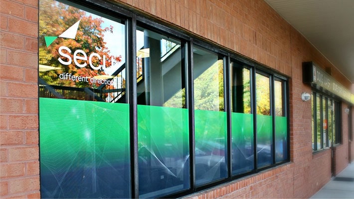
If you have a café or other similar sit-in type business, privacy is nice to have. One way to achieve privacy without sacrificing light is with frosted window film. What is really nice about frosted film is that it can be also a custom design that incorporates your brand’s colors. So not just a white frost, but any custom color frost.
3. Entice with Product Offerings
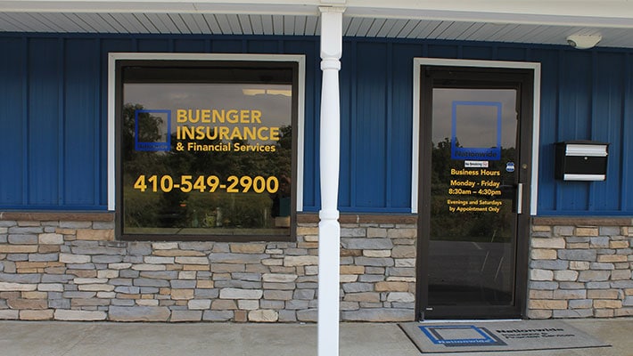
Custom printed window film can also include any type of design or imagery you want. Use this to your advantage. Showcase your product offerings on your storefront’s windows. Does your store sell home décor? Well in the fall you can showcase the new fall lines of products your store is offering to entice people inside.

4. Share Your Key Benefits
If your business has a key differentiator separating you from your competitors, share it. Shout it from the rooftops. In this instance, showcase it on your storefront’s window graphics. If your brand is youthful and vibrant—and it is this key differentiator that pulls people towards your brands—showcase this in your window graphics!
5. Less is More
When it comes to modern design, less is more. While your storefront window may be massive, that is not an excuse to cram as much information as you can. Instead, pick only the most important elements to portray so that the viewer has less distractions.
6. Use Contrasting Colors
When trying to read any design or graphic from far away, contrasting colors are key. Usually, with a branded design, you will want to incorporate your branded colors into the mix. That said, try and select the colors which contrast each other best. This will make the graphic easier to read from far away, potentially even when driving by on the road.

7. Be Transparent
If part of your business is showing people what it’s like to be inside, your window graphics can do this in a creative way. Incorporate windows of clear glass into your design that complement the full design itself. These allow you to show the interior of your store or restaurant in calculated ways while also advertising your brand with your window real estate.
The Best Queens Commercial Graphics Company
Are you still in need of assistance with the graphics for your storefront window? One Source Media can assist you! One Source Media is the top provider of applied graphics solutions and offers you superior applied graphics at a reasonable and upfront pricing. Call us right away at (929) 205-1088 for additional details.
* This article was originally published here: https://www.vehiclewrapping.com/2020/11/7-design-tips-for-storefront-graphics/
Find One Source Media on Google Maps: https://www.google.com/maps?cid=15155989429437533075
