Syndicated by One Source Media, Long Island City, New York
Effective fleet wrap design is key to getting real value out of your new fleet graphics. As a top fleet rebranding company, we’ve learned a thing or two about the elements of effective fleet graphics or vehicle graphics in general. Our aim is to share those elements with you to help make your upcoming fleet graphics project more successful. Here are some things to keep in mind when designing your new fleet wrap.

Making your Design Flexible
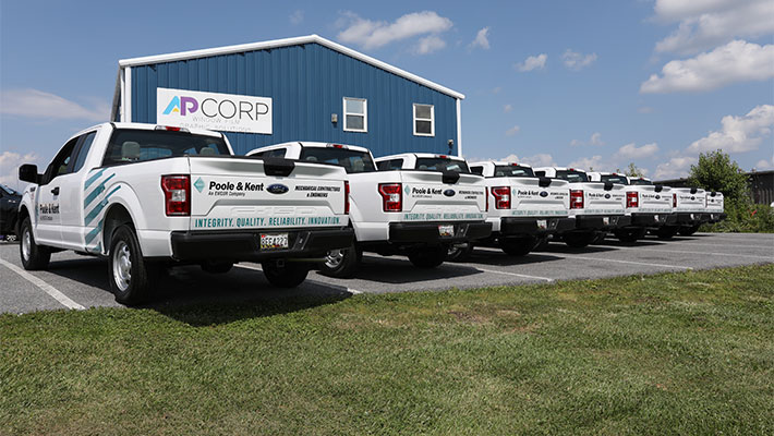
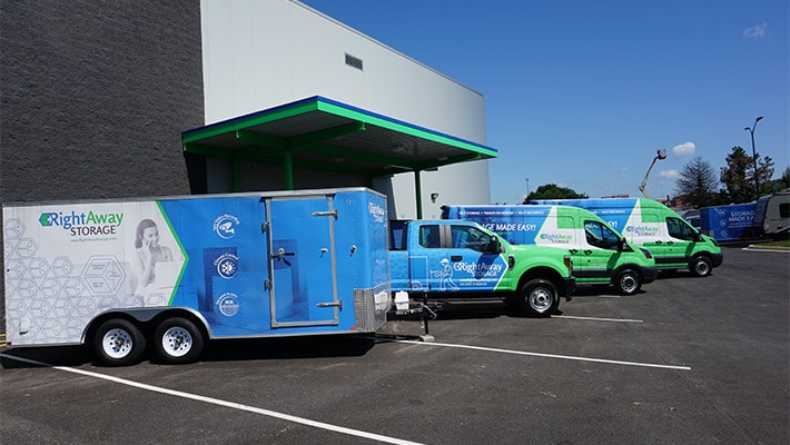
When crafting a new fleet design, try to make it transferrable to many different shapes and sizes of vehicles. This helps if you have a fleet made up of various makes, models, and years of vehicles. Similarly, this helps future-proof your fleet with a design that can fit any newer vehicles added to the fleet.
Size Does Matter
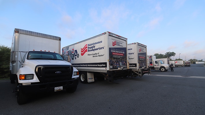
If your text is too small, it won’t be read. What if your text is too big? That will lead to lots of wasted space. Ideally, when it comes to size of your font or logos, you’re looking for something big enough to be read from far away, but not so big it wastes space. To build on this, it’s not only about reading from far away, but also about making it easy to read while the vehicle is moving.

Pick the Right Color Combinations
Color combinations are everything. First, use a color palette that is appropriate for your industry. For example, blues and greens are great for service industry companies as they are trustworthy, calming, and stable. If you’re looking for an energetic color, opt for a red or yellow.
Color contrast is also very important for fleet graphics. You want those colors to pop so they can be easily read from far away. As an example, blue text on a white background will pop a lot better than blue text on a green background. If color psychology isn’t in your wheelhouse, your local fleet graphics company should have a designer who is happy to help.
Proper Placement is Important
The side of the vehicle is the largest space—but that doesn’t mean it should take all of your attention. In fact, the rear of a vehicle will be seen as much as (if not more than) the side of your vehicle. People behind your vehicle in traffic, at stop lights, etc… will have lots of time to review all the information you’ve put there. So be sure they can get all the information they need to perform the action you want.

Blank Space is Good
It’s important not to look at blank space as a wasted opportunity. It is comparable to taking a breath between sentences. Leaving blank space in your design gives the opportunity to accent important parts of your wrap design. Similarly, by limiting the amount of clutter, it provides a clear message with minimal distractions. This ensures the important elements are seen and read quickly.
* This article was originally published here: https://www.vehiclewrapping.com/2020/10/elements-effective-fleet-graphics/
Find One Source Media on Google Maps: https://www.google.com/maps?cid=15155989429437533075
